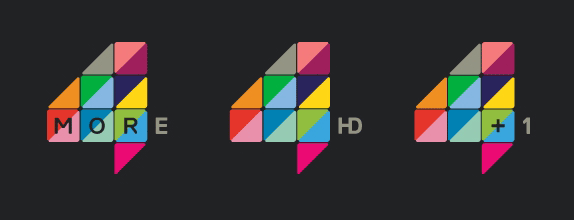
I think the More4 logo is a great eye catching logo. The bright vibrate colours are nicely contrasted with the dark grey background. The text is also integrated into the logo and the 'E' completes the 4 shape. I like the way the triangles are used to make up the logo as well.
 |
| The logo can be used with a variety of text, for different purposes. |


