Tuesday, 19 November 2013

Research- personal logo

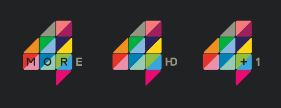
I think the More4 logo is a great eye catching logo. The bright vibrate colours are nicely contrasted with the dark grey background. The text is also integrated into the logo and the 'E' completes the 4 shape.  I like the way the triangles are used to make up the logo as well. 


The logo can be used with a variety of text, for different purposes.

Tuesday, 29 October 2013

Updated logo

This is the updated logo which addresses some of the feedback. I changed the font and adjusted the spacing so it's all lined up correctly with the rest of the logo and all the squares have been adjusted. 
I have used 4 starting colours- Green, blue, red, purple. The rest of the colours come from shades of these colours. 
LPC- Myriad Pro   STATIONARY- Code Light


I also got some feedback the white pen head floated in the coloured squares so in this variation the pen head has been scaled to the outer edges of the squares. 


I wanted to see if I could create a similar logo that combines the coloured squares and the pen head into one unit and this is what I came up with. I think it works quite well and I think it could be used in conjunction with the main logo. It could be used on the livery or any signage.
If my logo was used, LPC's trademark would be the coloured squares and the pen head so combining the two would still be recognisable with LPC's customers.


Monday, 28 October 2013

Continuing development - Pen head

I thought it important to create some variations on the pen head image and then critique my work.

No. 1- Too tall and curvy, reminds of an an alien space ship and not a pen head.
No. 2- I like the design apart from the pointed ends, it looks too aggressive. Not a message I want to convey in my logo.
No.3- The top is too wide and the middle is to thin.  The pen head shape isn't obvious enough, when someone looks at my logo I want them to immediately see the pen head shape.
No.4- To straight and rigid, no flow to the shape.
No.5- I really like this design. There's a nice contrast between the straight and curved edges and the tiny circle in the centre acts as a focal point for the shape.
No.6- The shape seems out of proportion, I want my design to have symmetry and also balance.


LPC logo- Re-visit

I got some feedback that my logo had possibly too many coloured squares. My thinking behind this design choice was that the many coloured squares would represent the individual customer that would buy stationary in a small amount in-store, contrasting with the corporate audience. Also when I think of stationary I think of many different colours from the paints,inks, pencils etc. But I thought it was important to a complete design process that I explore different colour schemes and ideas.


My logo with alternate colour scheme
Current LPC colour scheme

I decided to experiment and use the current LPC colour scheme (blue and yellow) with my logo. When I first seen the LPC logo and it's colour scheme I didn't think it was very visually appealing at all. The colours don't compliment each other and it seems quite dated, lifeless and uninteresting.

I also got some feedback that my lettering, specifically the 'LPC', was not working as a unit. I could see the problem here as the 'LP' and 'C' seemed separate from each other, they needed to be spaced with equal distance to make the logo work. So I experimented with some different fonts and letter spacing.


From this I discovered that a thick font for the 'LPC' combined with a thin font for the 'stationary' works quite well, so I amended my logo.

Updated font and colour scheme.

These logos were designed using the current LPC colour scheme but but with a much needed update. Instead of yellow and blue block colours I went for a more gradient style. Although I think these logos work well with their updated colour schemes I still like my idea of the many coloured squares.

Combining font and squares.
This was just seeing how my font would work on top of the coloured squares. This demonstrates that text is still legible on top of these squares in case LPC would want to do this on any of their livery.
Thursday, 17 October 2013

LPC livery

Letterhead


Compliment slip


Business card- Front/back

LPC logo (final design)

As it stands this would be my final logo design, but of course more development and changes can be made.
I thought it was important to understand my audience (or LPC's audience) to design the most effective logo possible. On one hand LPC sells stationary in bulk to companies and events, but on the other hand LPC is for simple in-store purchases e.g An art student buying a sketch book or colouring pencils. So LPC's audience is quite corporate but the individual is also an important part of their audience.

This is made quite clear on the website "Whether you’re equiping your entire company, or replacing your childrens school stationery, you can receive supplies quickly at a competitive price."

Upon reading '10 Tips for effective branding' I came across this quote which stresses the importance of the audience, "Consider who is going to be receiving, reading and using these guidelines and tailor the content accordingly."

So with that in mind I created a logo that I believe tailors to both, a playful and approachable logo with a business edge. The pen/quill head speaks to the business or corporate audience and the individual coloured squares (or pixels) speaks to the individual customer interested in purchasing stationary in small quantities. 


LPC logo experimentation

I liked the pen/quill shape but I thought it was too plain and uninteresting if it was just kept black so I decided to add colour. Instead of colouring the actual pen head I decided to put it on a coloured, pixel style background, I believe it fitted quite well on it. It was just a case then of how I would merge the two. So I did a series of iterations and experiments to see which version of the pen head would suit the coloured squares best. I wanted the pen head to stand out, I didn't want the coloured squares to overpower the shape.
I decided to go for the white pen head. It seemed a nice use of negative space on the coloured background. A tall thin font, placed at the bottom of the logo, seemed to work best also.


LPC Logo- Illustrator concepts

After the sketching process and researching other logos I came up with this series of concepts. Not all polished and professional looking but I simply wanted to quickly fill up a page with logo designs and see if any had potential for further development. 


I planned to colour this design (which I created with the pen tool) with a gradient of colour, going from warm colours too cool. Also I was aiming for a spiral like design coming from the centre of each letter. I attempted this in illustrator but it didn't work out and I realised I was complicating things too much for myself. The best logos are the simplest.


So I went back and looked at my illustrator concepts and I thought the pen head shape was quite effective and it had some potential for further development. 

Research- Pixel style logos

I came across some logos that incorporated a pixel style. Usually when working with logos and other design work the designer tries to avoid showing pixels. Having the pixels visible would show a lack of quality but some designs I've seen embrace this. This has led to a unique 'retro' style that appeals to young and old audiences alike.


Below is a link to a variety of pixel style logos
Pixel-Inspired Logo Designs

Tuesday, 15 October 2013

Final concept- A design.

This is my final logo which I decided to use the letter 'A' as the focal point.  I believe at this stage my work has a simplistic minimal style to it so I wanted my logo to illustrate this. I used a colourful polygon style to create the letter 'A', it's abstract but still readable.
The second logo is a slight variation, the logo is reflected and I have added some shadows to give it a 3D effect.
Multiple bright colours on a grey background seems to be quite common as it works well so I implemented this in my logo too.


Personal logo- Concept variation

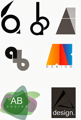
At the early stages of development I was experimenting with the letter a and b to see what kind of designs I could come up with. A lot of my early designs I thought felt somewhat dated and uninteresting, so I aimed for a more contemporary design. There are some logos on this page that I believe have some potential, such as the middle right and lower right.

Illustrator designs


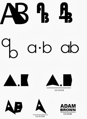
I tried here to created simple black and white text logos using Illustrator. Some designs didn't work out but this experimentation was useful none the less.On the bottom half of the page there is a clear evolution of the block 'A' design. I started with a simple triangle for the A and stretched it and pulled it into a more abstract shape. I also added a smaller white triangle in the centre to make it look more like an A. I took away the 'B' shape because I thought it just cluttered the design.
In my research I came across an 'A' that was made up of coloured triangles, so ill explore that option in further final designs.
Plain text logos

Monday, 14 October 2013

More research- Logos I like

As I am designing a logo and brand for a company that sells stationary I believe a colourful theme is quite important, so I am focusing my research on colourful brands.


I like these logos because they combine a simple colourful image with plain text. I think it works quite well as it can be placed in a variety of backgrounds. I will consider this style for my own future designs.


If I am to use this style for the new LPC logo could use a stationary related image and the letters LPC beside it. Such images could be a paint brush, an open book, pen nib etc.

I will continue to sketch out some LPC logo concepts. 


Tuesday, 8 October 2013

Research relevant to my own brand

I was tasked to create a personal logo that would be unique to me, a logo that would be recognisable as my own brand. I needed the logo the come from the letters of my name, whether that be my full name or just my initials, it was up to me.
I began to look for logos that simplified multiple words into a concise and simple design. I find that simple shapes and lines communicate and sell ideas very effectively, so I kept that in mind while carrying out my research.


1. Bio and Beauty

This brand's identity has a muted colour scheme and combined the '2' and 'b' into quite an attractive and clear design. There is also writing underneath the logo which shows that I could easily add more information underneath my own logo if I thought my logo was wasn't clear enough or too abstract. The writing doesn't detract from the logo.


2.A Type

I really liked the way this designer had so many variations on the letter 'A'. Using line and colour he created some very effective designs that all came from the same shape, the letter 'A'. I especially like the polygon design were he split up the letter into different coloured segments. I would like to use this style in my own logo but perhaps make it more abstract.

3.Text heavy logos

This page contains a variety of logo's that use minimal imagery and contains mostly text, there are also solid black and white designs. Although these logos are text heavy they are still quite visually striking, this is achieved through their choice of font and layout.
I thought it was important to research logos of this type because my own logo would be based on the letters of my name. When creating my own logo I will keep in mind the style of these logos.