| My logo with alternate colour scheme |
| Current LPC colour scheme |
I decided to experiment and use the current LPC colour scheme (blue and yellow) with my logo. When I first seen the LPC logo and it's colour scheme I didn't think it was very visually appealing at all. The colours don't compliment each other and it seems quite dated, lifeless and uninteresting.
I also got some feedback that my lettering, specifically the 'LPC', was not working as a unit. I could see the problem here as the 'LP' and 'C' seemed separate from each other, they needed to be spaced with equal distance to make the logo work. So I experimented with some different fonts and letter spacing.

From this I discovered that a thick font for the 'LPC' combined with a thin font for the 'stationary' works quite well, so I amended my logo.
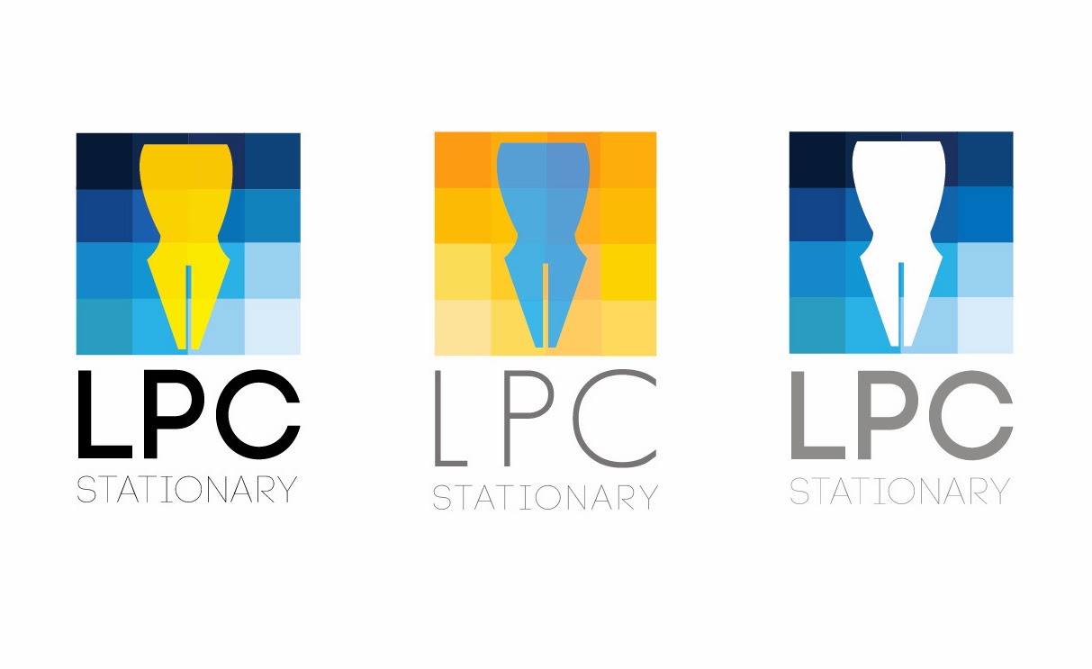 |
| Updated font and colour scheme. |
These logos were designed using the current LPC colour scheme but but with a much needed update. Instead of yellow and blue block colours I went for a more gradient style. Although I think these logos work well with their updated colour schemes I still like my idea of the many coloured squares.
 |
| Combining font and squares. |
No comments:
Post a Comment