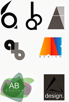
At the early stages of development I was experimenting with the letter a and b to see what kind of designs I could come up with. A lot of my early designs I thought felt somewhat dated and uninteresting, so I aimed for a more contemporary design. There are some logos on this page that I believe have some potential, such as the middle right and lower right.
 |
| Illustrator designs |
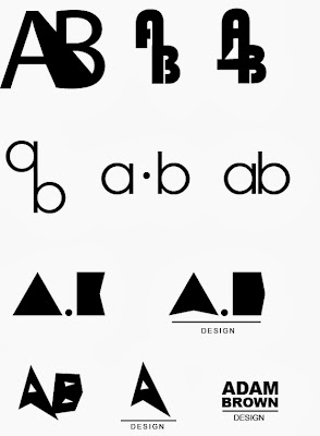
I tried here to created simple black and white text logos using Illustrator. Some designs didn't work out but this experimentation was useful none the less.On the bottom half of the page there is a clear evolution of the block 'A' design. I started with a simple triangle for the A and stretched it and pulled it into a more abstract shape. I also added a smaller white triangle in the centre to make it look more like an A. I took away the 'B' shape because I thought it just cluttered the design.
In my research I came across an 'A' that was made up of coloured triangles, so ill explore that option in further final designs.
 |
| Plain text logos |


No comments:
Post a Comment